Kerry May

kerrymaydesign@gmail.com

Kerry May
x

FÍS

Identity & UX Strategy (year 3)

Delivered:

Brand Identity / Logo Design / Motion Graphics / Brochure Design / Signage / Promotional Assets

Skills:

Research / Miro / Figma / Typography / Photography / Colour Theory / Adobe Creative Cloud: Illustrator, Photoshop, InDesign, Bridge, Lightroom Classic, After Effects, Adobe Media Encoder

Project Summary

FÍS is expanding into secondary schools. The challenge is to conceptualise an identity that bridges the primary and secondary levels, maintaining FÍS’s recognisability while appealing to an older student demographic. The new identity should reflect the core values and objectives of the FÍS project while also appealing to post-primary school students and their teachers. The identity should support the teaching of film and drama in the classroom.

My Approach

I chose to move away from the primary FÍS visual identity, which featured subdued colours and outdated film equipment such as film reel strips, film cameras, and ticket stubs. As the main graphic inspiration for the identity I modernised the design by incorporating digital and online film elements, paired with bright, fun colours to reflect the exciting subject matter and engage a young, enthusiastic audience.

Audience

Post-primary school students and their teachers.

FÍS Brand Story

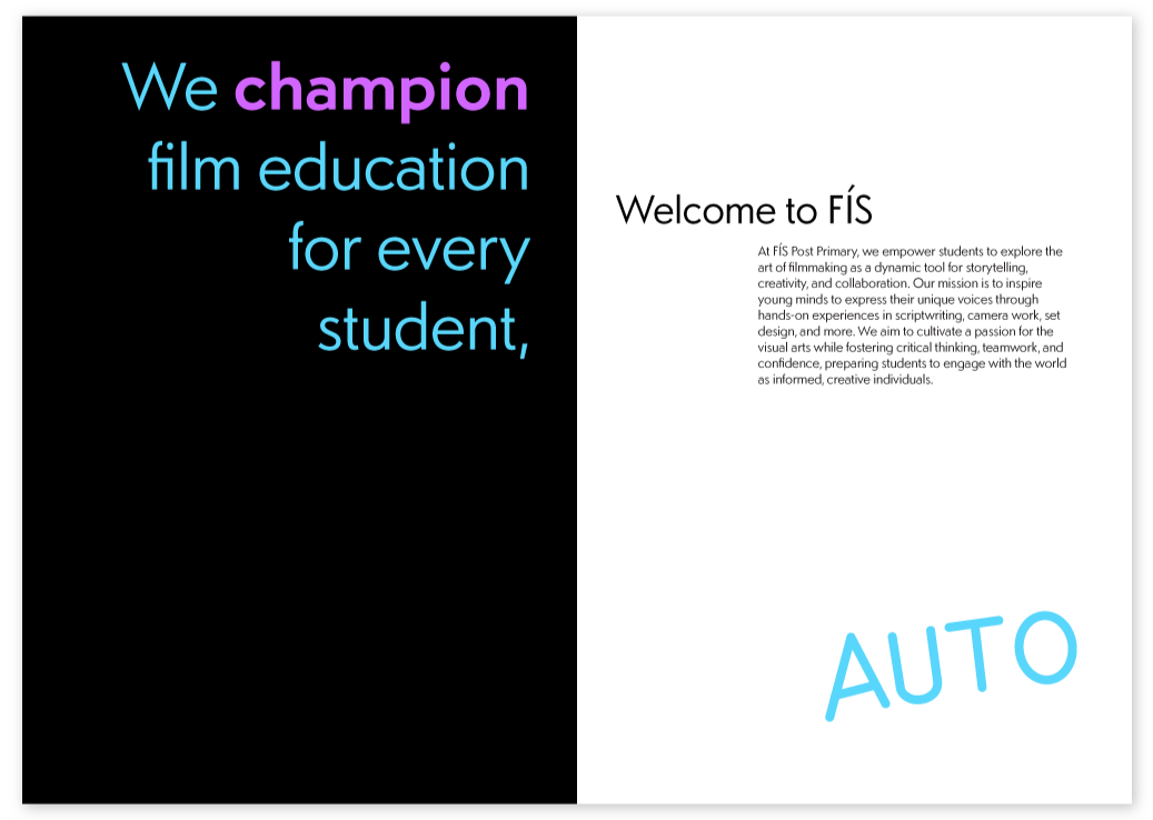
At FÍS post-primary we empower students to explore the art of filmmaking as a dynamic tool for storytelling, creativity, and collaboration. Our mission is to inspire young minds to express their unique voices through hands-on experience in script-writing, camera work, set design, and more. We aim to cultivate a passion for the visual arts while fostering critical thinking, teamwork, and confidence, preparing students to engage with the world as informed creative individuals. We are on hand as an easy resource source for students and teachers alike.

Research

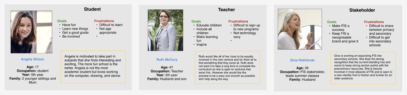
My research for this project included a brand audit of the existing FÍS visual identity—examining its logo, assets, and overall design language—as well as a competitor analysis of similar film education initiatives. I also conducted interviews with stakeholders and teachers involved with FÍS. Based on these insights, I developed personas to represent each of the key audience groups.

persona for student, teacher and stakeholder of FÍS

Key Findings

I summarised my research into four key findings about the current FÍS brand, identifying the main challenges I needed to address in my design.

four of my key findings from the current FÍS brand

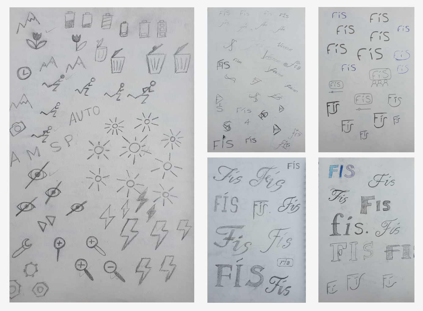
Concept Exploration and Iteration

The current primary school FÍS logo centered around the clapperboard. I chose to modernize the visual identity by using references to the digital camera and online video watching.

Photographs of five paper sheets with pencil doodles showing different styles of typography for the word FÍS and pictures of digital camera settings symbols; auto, zoom in, no red eye, bright light, bin, etc.

Visual Identity & Logo Design

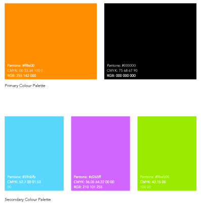
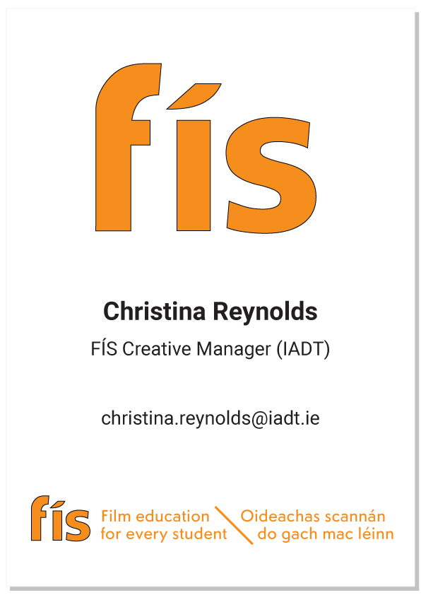
I developed three logo concepts to present to FÍS stakeholders and selected one as the foundation for the visual identity. I chose to retain the existing brand colours for easy recognisability. I designed a stationery suite—including A4 and DL envelopes, letterheads, compliment slips, and business cards. Feedback from stakeholders and lecturers revealed that the identity felt too corporate for a post-primary school audience. Later, I simplified the logo and refreshed the design with brighter, more engaging colours.

Three logo ideas showing: One - a lowercase fís in a curved rectangle with a scroll bar below (AKA an online video watching reference). Two - a lowercase fís in a curved rectangle with three simple people shapes below (AKA a movie theatre reference). Thre - a capital FÌS arranged in a way to make it resemble a smiling face with the lower horizontal bar of the F being one eye, the Í being the nose, the top curve of the S being another eye and the lower curve of the S lengthened and exaggerated to sweep under the Í and make the smile.
the stationary all have the logo one (lowercase fís with online video watching graphic reference) the letters are bold and coloured; f is light blue,í is dark blue, and s is dark purple. The logo appears in the top left corner and there is a curved line of each colour in the top right corner and smaller in the bottom left corner

Brand Guidelines

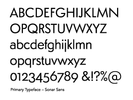
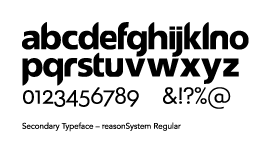
The brand guidelines were established, including the logo—with a tagline available in English and/or Irish—along with the typography and colour palette.
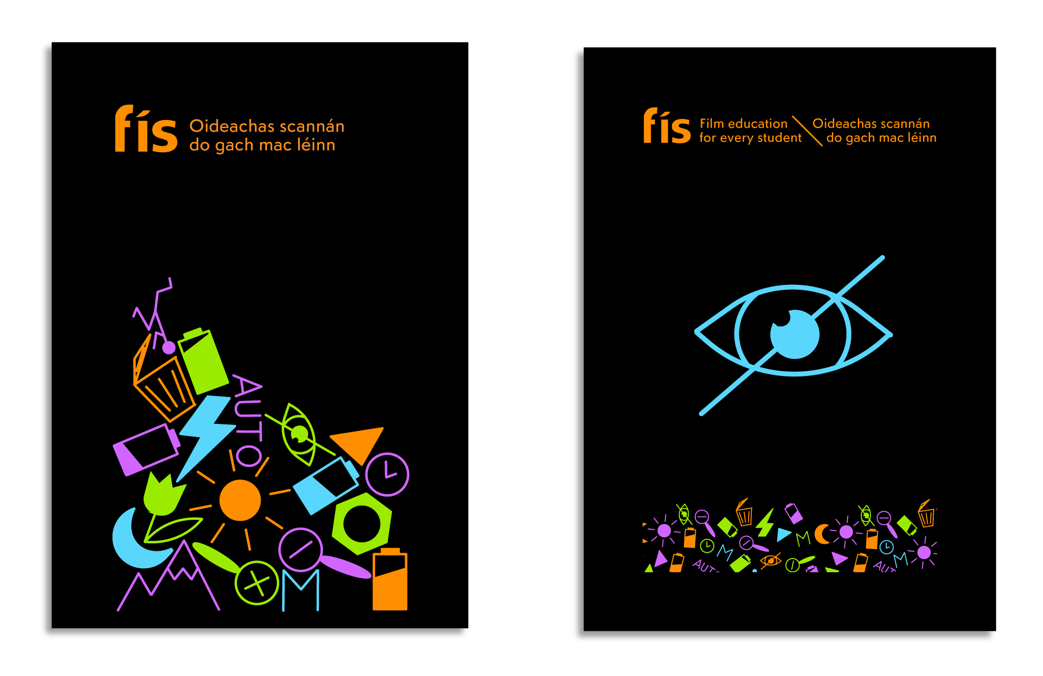
upper and lowercase alphabet and symbols
a separate rectangle of the following colours: orange, black, blue, green and purple with their unique Pantone, CMYK and RGB identity numbers

Posters

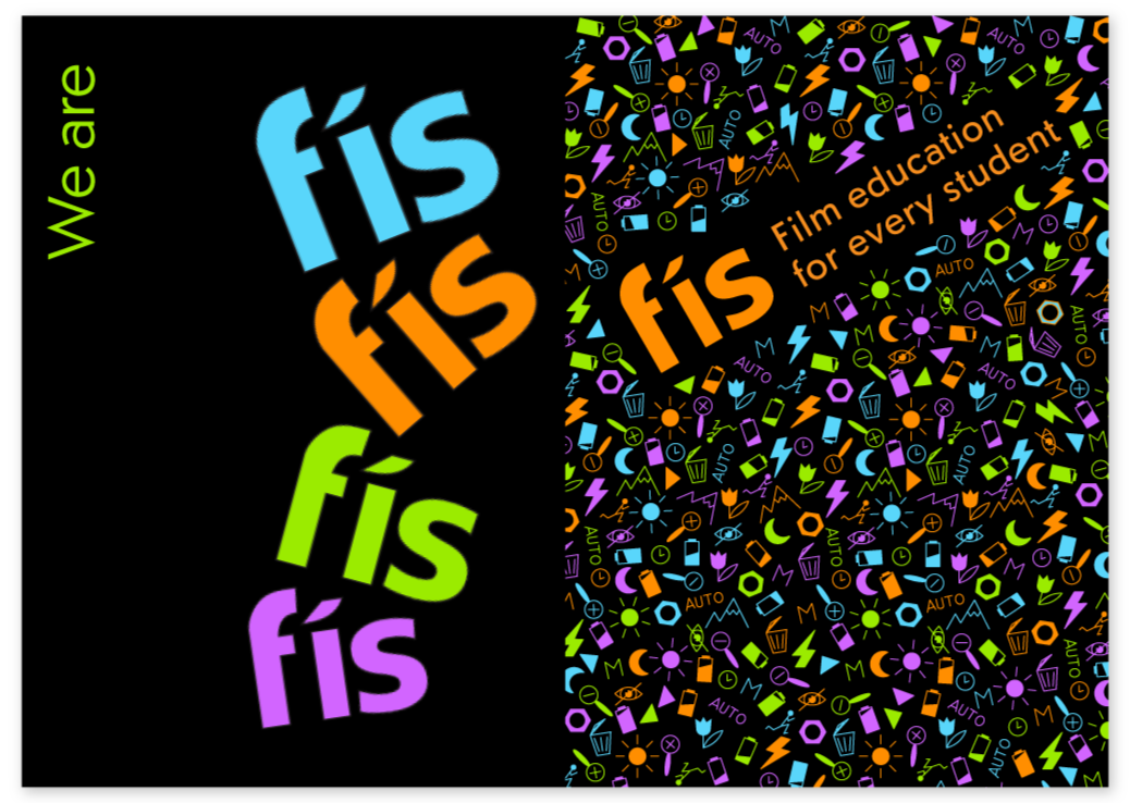
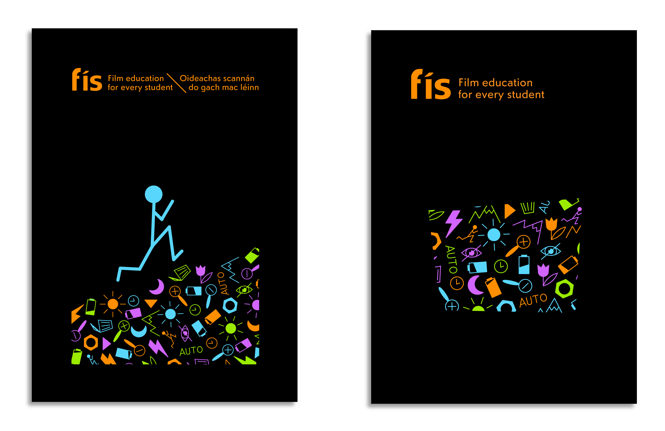
I designed four posters, each featuring the master icons as the central focus. The black background enhanced the vibrancy of the colours, making them stand out.
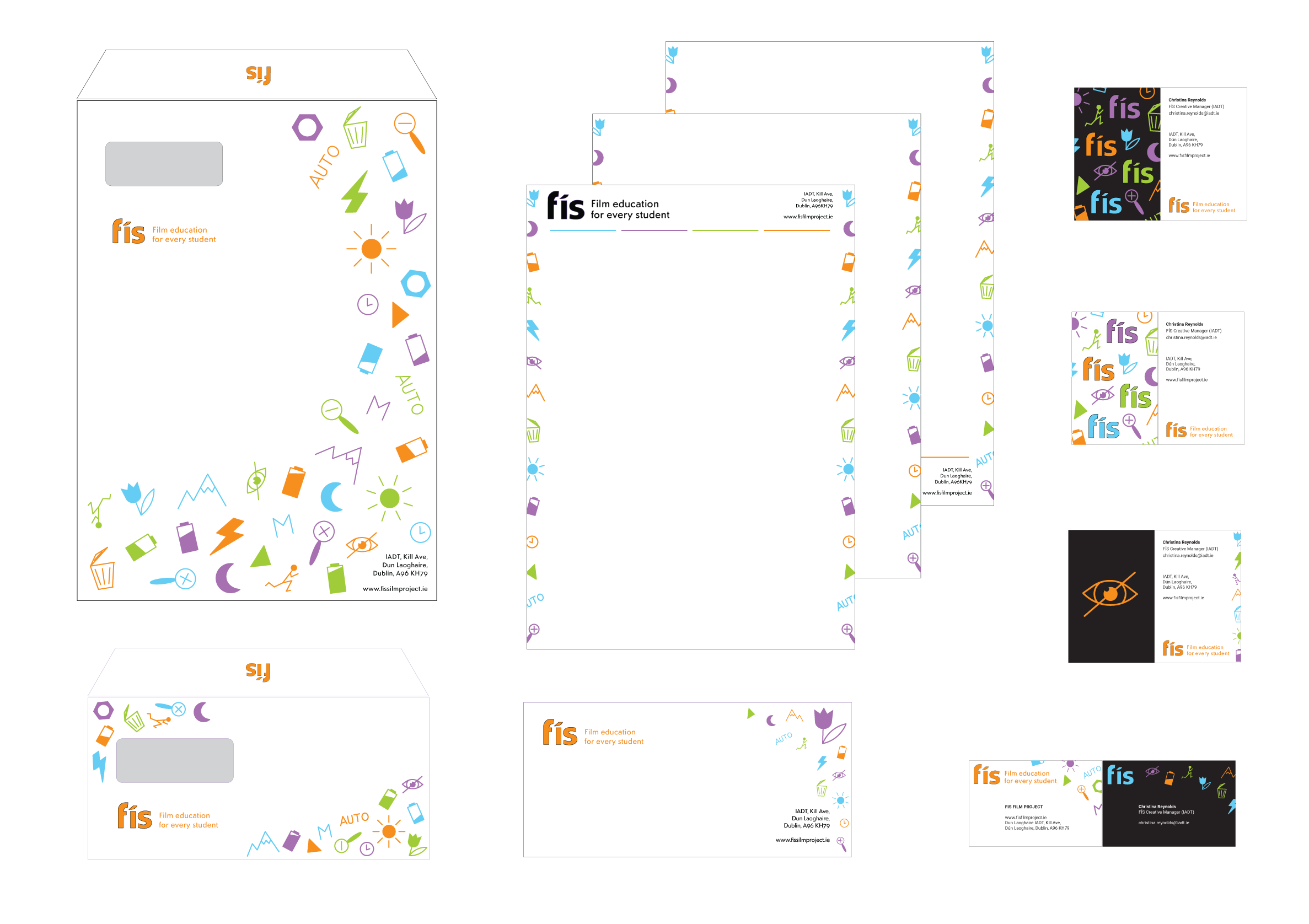
Two black background portrait rectangles. Both have the orange fís logo and tagline at the top centre. One has the digital camera icons in a random mix of the brand colours positioned in an incline to the right with an enlarged blue, stick figure person running up the hill. The other has the digital camera icons in a random mix of the brand colours cropped out by an irregular rectangular shape.
Two black background portrait rectangles. Both have the orange fís logo and tagline at the top centre. One has the digital camera icons in a random mix of the brand colours all sitting precariously on top of eachother in a seemingly randon pile. The other has the digital camera icons in a random mix of the brand colours sized small in a line along the bottom with an enlarged blue line drawing on an eye with a diagonal line through it (no red eye symbol) in the middle, centre.

Stationary suite

A new stationary suite was designed including A4 and DL envelope, letter heads, compliment slip, and business cards.

Simplified orange fís logo with a random assortment of the digital camera icons in the brand colours

Office Signage

Simplified, large orange fís logo at the top, centre. Underneath is the name of the office peron, their title, email and at the bottom is the full orange fís logo with the tagline in English \ Irish.

Motion Graphic

I aimed to create a bold motion graphic piece that used the vibrant brand colours and incorporated photographic visuals. I wanted to highlight FÍS’d core values. It needed to engage and inspire both students and teachers while explaining the importance of FÍS and the incredible work they do.

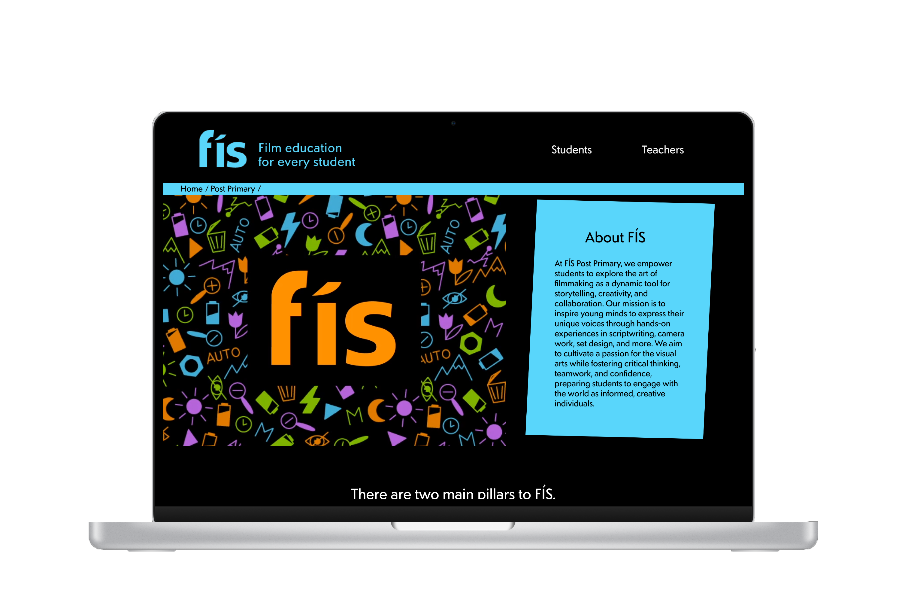
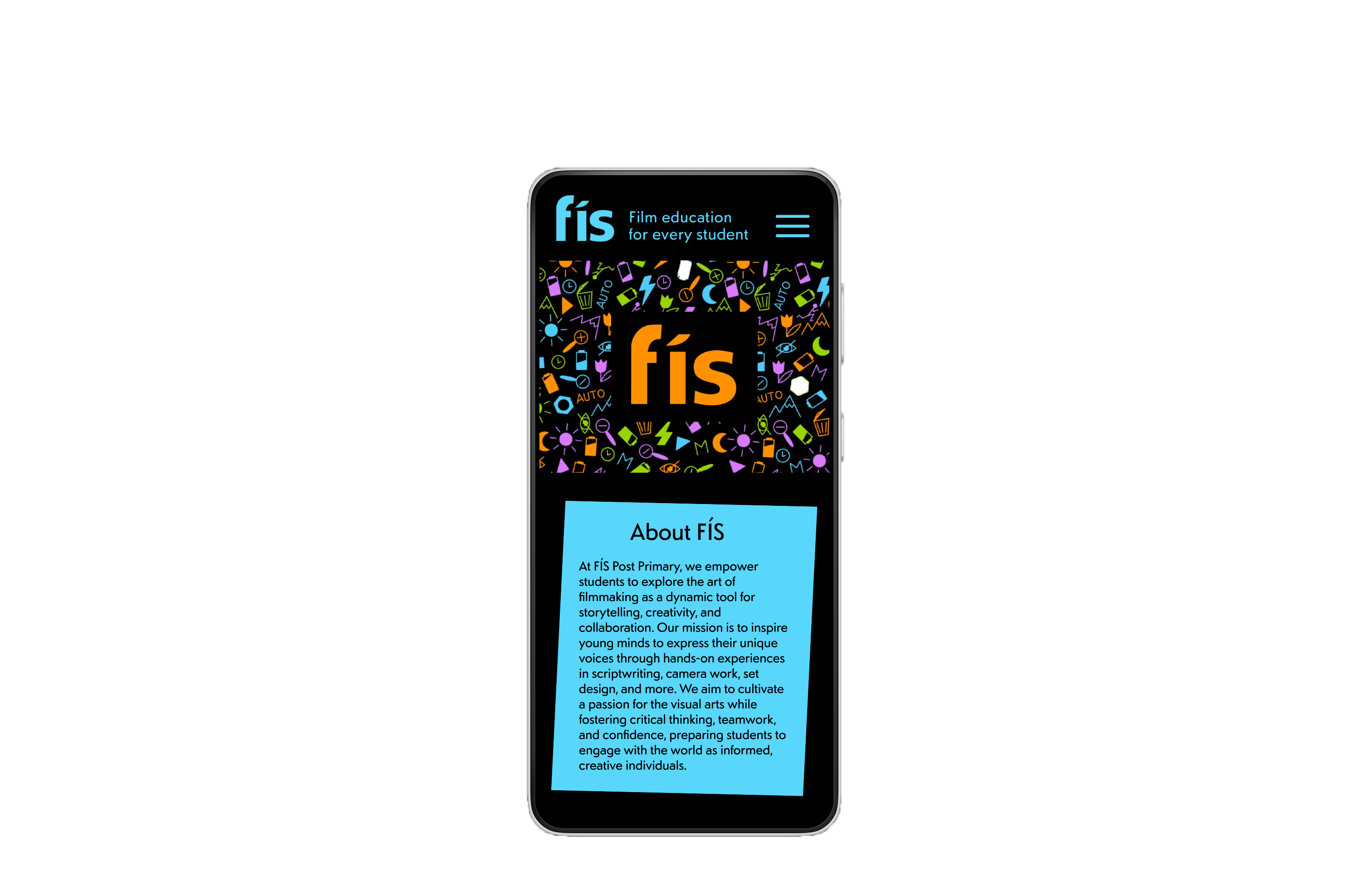
Responsive web design

The three main sections—Home, Students, and Teachers—were each distinguished by a specific, targeted colour palette to suit their audience.
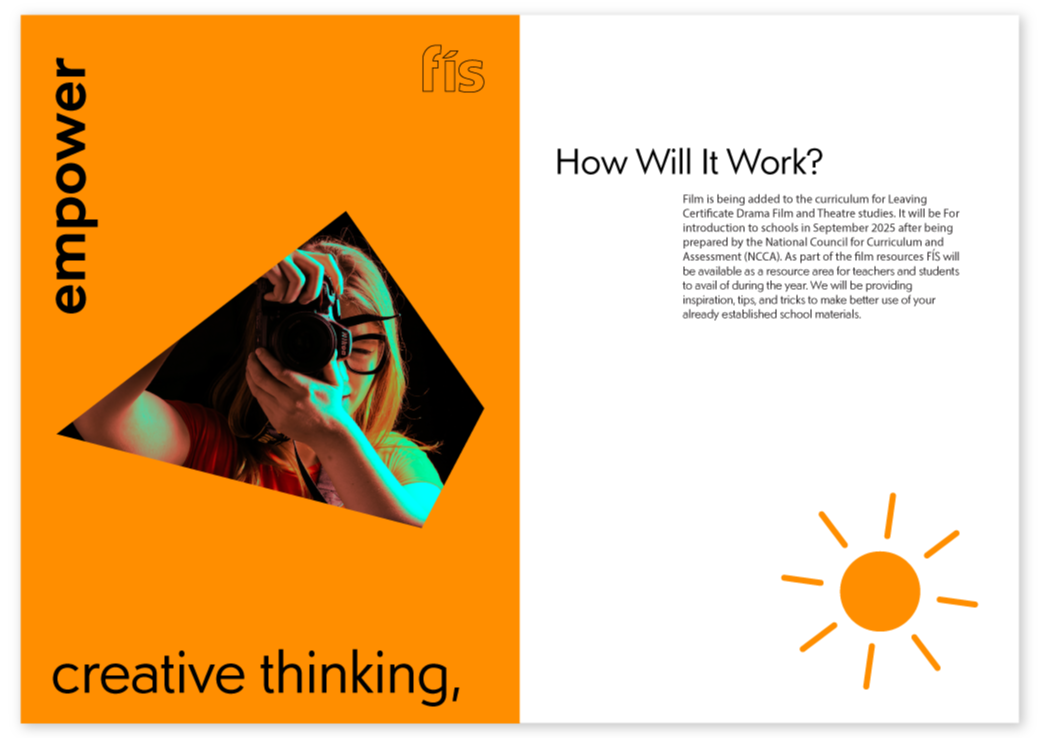
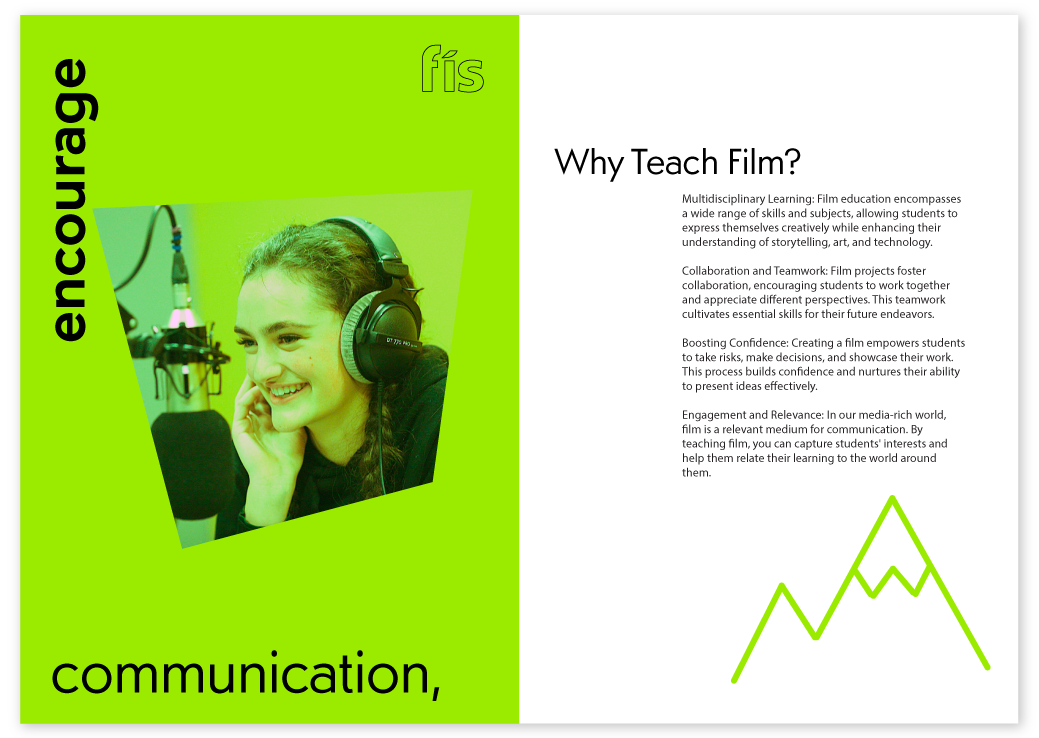
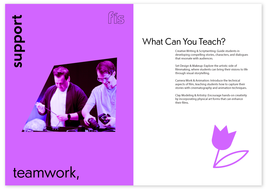
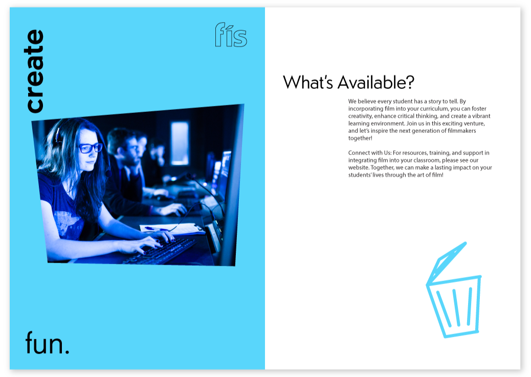
mockup of the website I created on a silver laptop
mockup of the website I created on a mobile

Brochure

Inspired by the visuals from my motion graphic piece, I designed a promotional brochure specifically for teachers. Its purpose was to address common questions and encourage educators to incorporate FÍS into their classrooms while I wanted to encapsulating FÍS’s core values

front and back brochure cover
brochure page 1 & 2. Page 1 has black background with the words 'we champion film education for every student'. Page 2 has a paragraph about FÍS
brochure page 3 & 4. Page 3 has orange background with the words 'empower creative thinking'. Page 4 has a paragraph about how it works
brochure page 5 & 6. Page 5 has green background with the words 'encourage communication'. Page 6 has a paragraph about why you should do it
brochure page 7 & 8. Page 7 has purple background with the words 'support teamwork'. Page 8 has a paragraph about what you can teach
brochure page 9 & 10. Page 9 has blue background with the words 'create fun'. Page 10 has a paragraph about what is available