The Good Guide
The Good Guide is an initiative aimed at equipping students of creative arts, design, media, and technology with the knowledge and tools to embrace ethical and inclusive practices in their work. At its essence, The Good Guide promotes sustainability, equality, diversity, and inclusion (EDI), and harnessing technology for positive impact. The objective is straightforward: to minimise harm in creative pursuits and actively contribute to positive change.
Secondary Research (desk-based research)
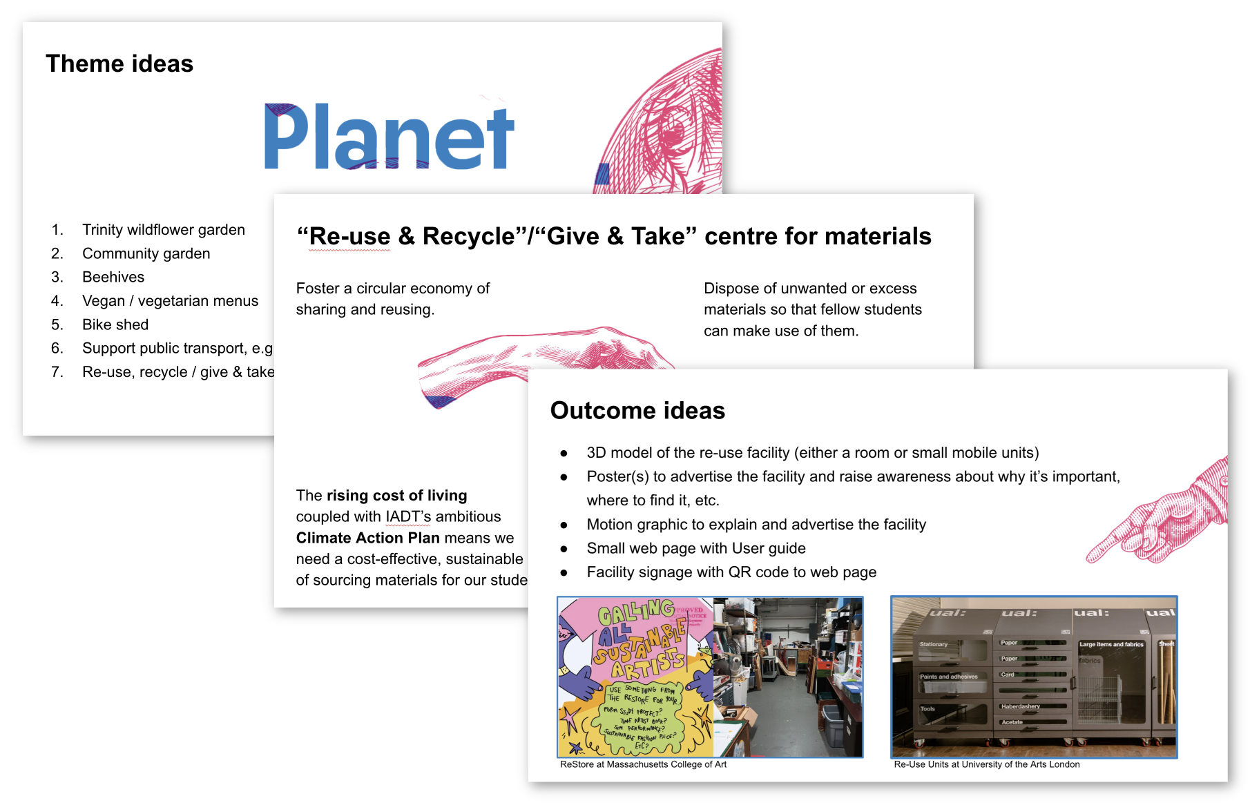
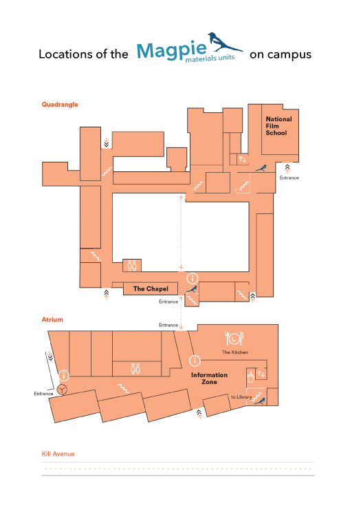
I explored green initiatives at other colleges and businesses before deciding on a reuse facility. I investigated available spaces on campus—such as unused rooms and cupboards—and found that standalone units, like those at the University of the Arts London, would be most effective given our limited space.
Primary Research (field research)
I assessed the surplus materials, equipment, and tools available at the college for reuse, considering their size and storage requirements.
Icon Design
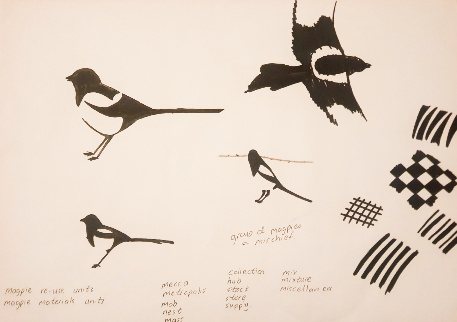
I needed a distinctive icon for the map to mark each unit’s location, one that reflected the brief’s ethos and stood out among other campus icons (e.g. toilets and the canteen). The magpie was ideal, as it’s widely recognised in Ireland as a collector of abandoned materials.
Visual Identity
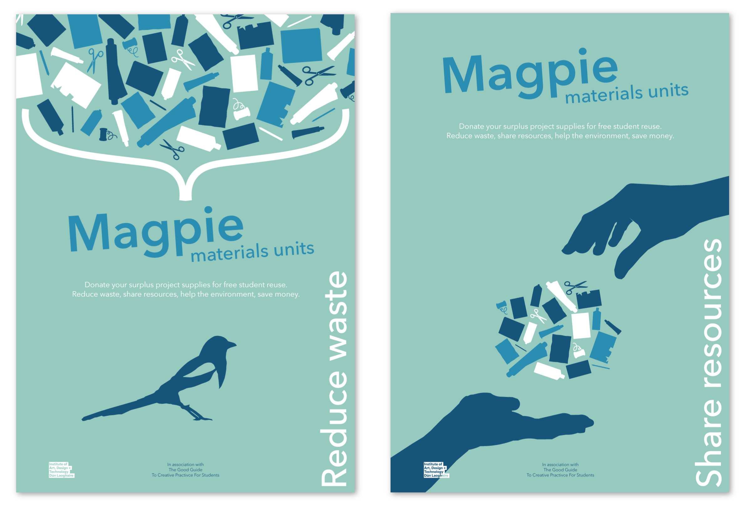
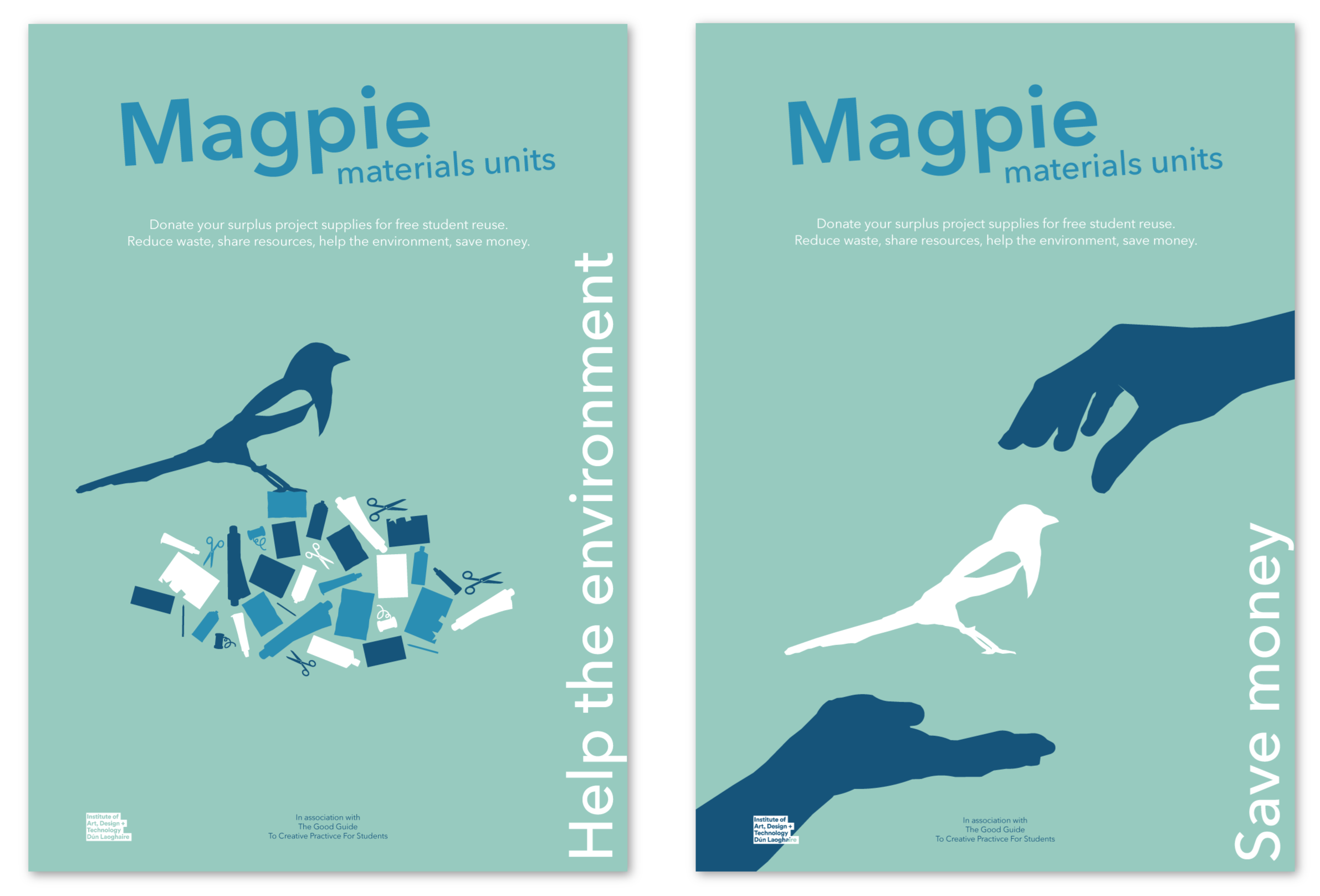
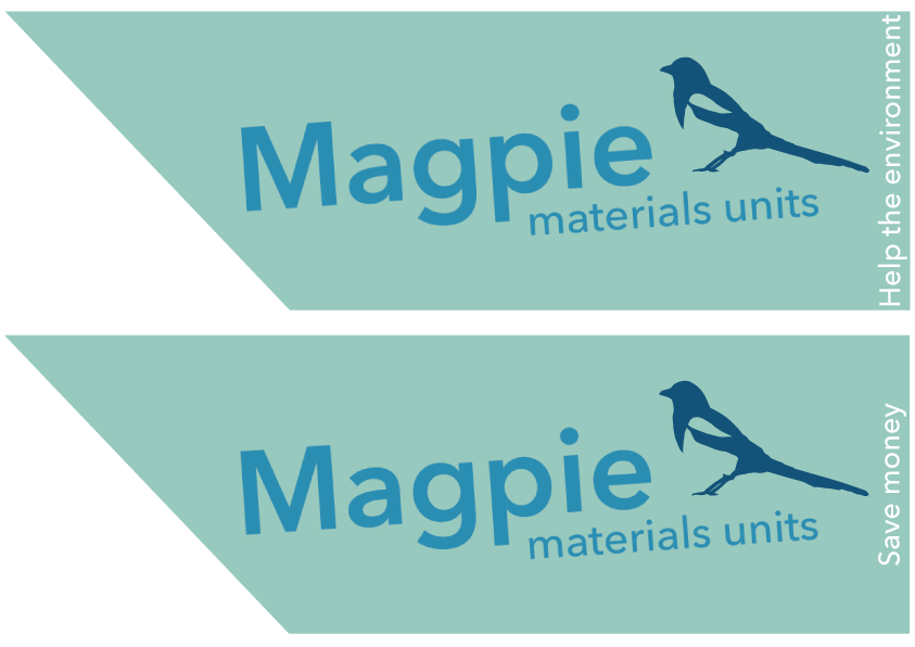
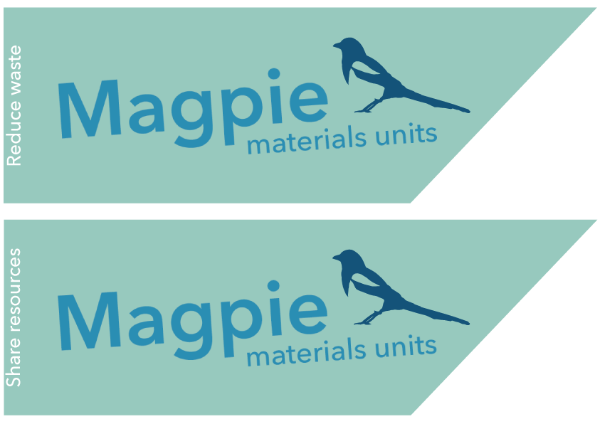
I chose these colours for their alignment with the Go-Green ethos, inspired by a poster I’d seen. In hindsight, the logo lacks contrast against the background, and I would revise the colour choice for better visibility.
Signage
I created arrows shaped like the units to clearly direct students where to go.
Interior Design
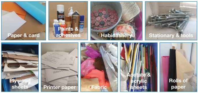
In designing the units, I considered the size and shape of materials available at college and how to store them for easy access. I grouped similar materials and created separate compartments for variations in colour, thickness, and type.
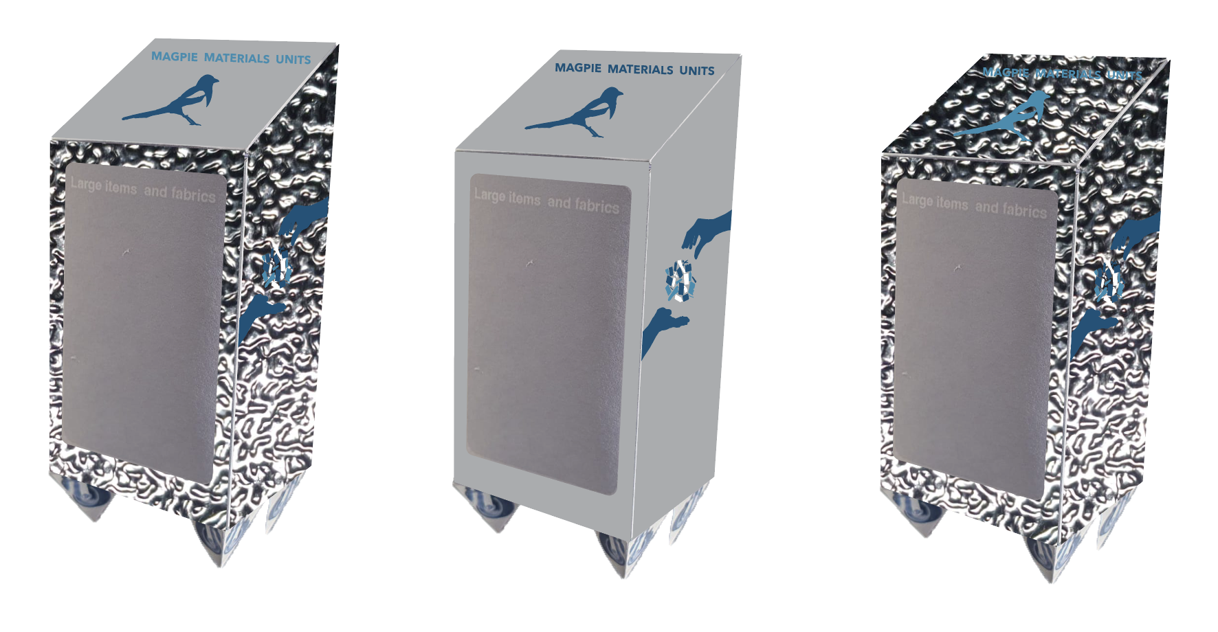
Exterior Design
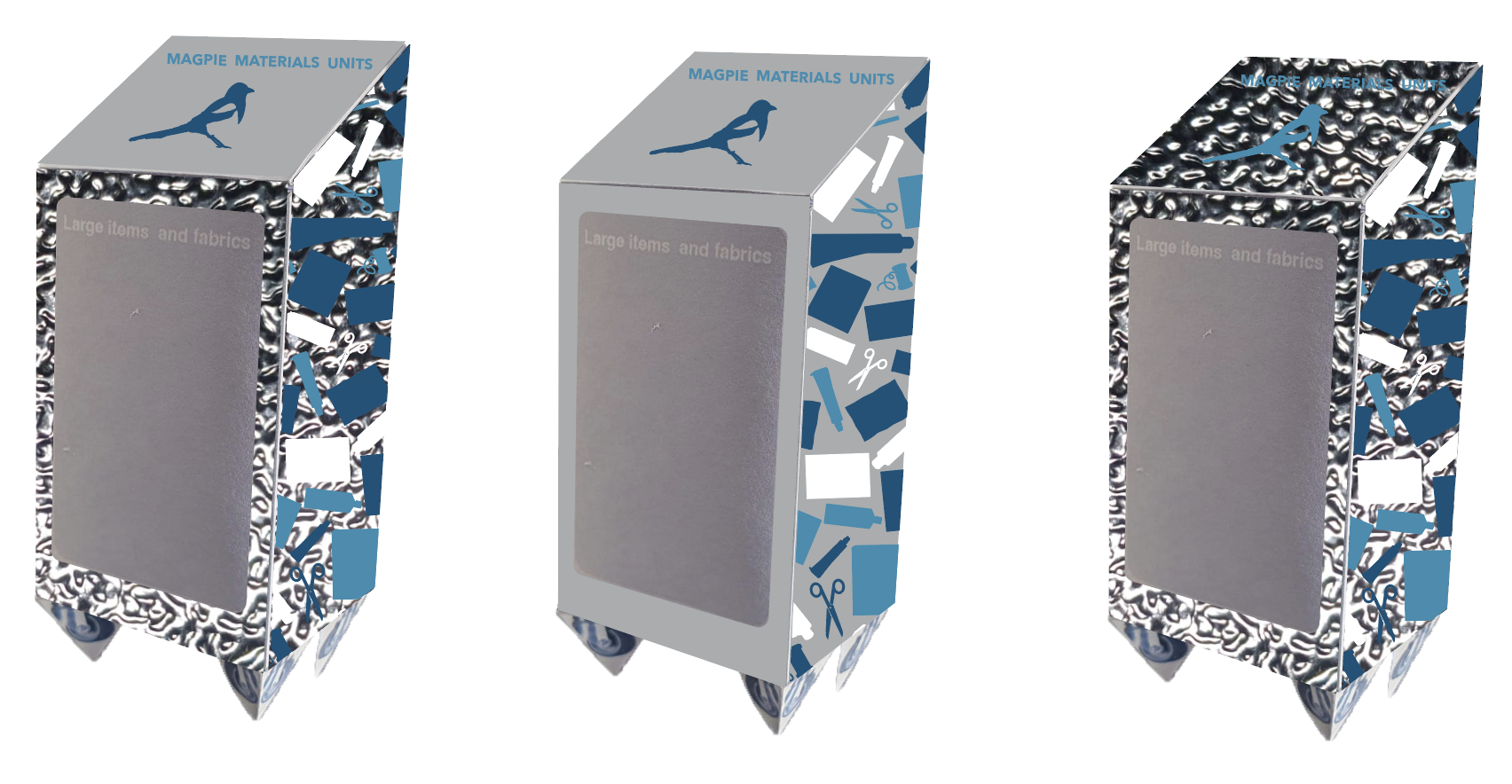
I explored a reflective finish to echo the magpie theme but chose a poster-style design due to cost and practicality. I created a 3D prototype and applied the design.
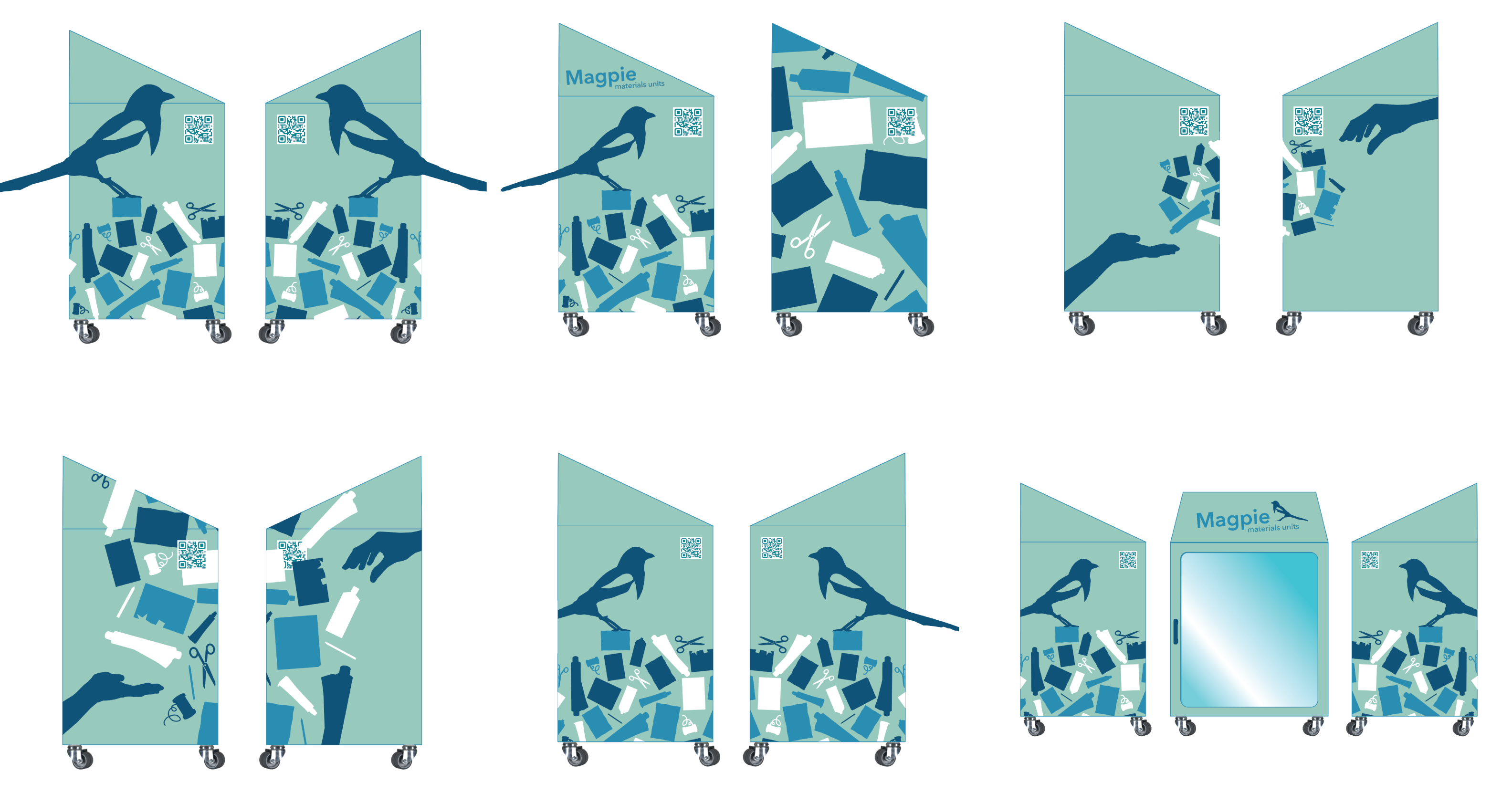
Design Iterations
I used Adobe Illustrator to create several design concepts for the sides of the material units based on the previous poster designs.
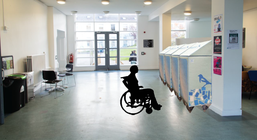
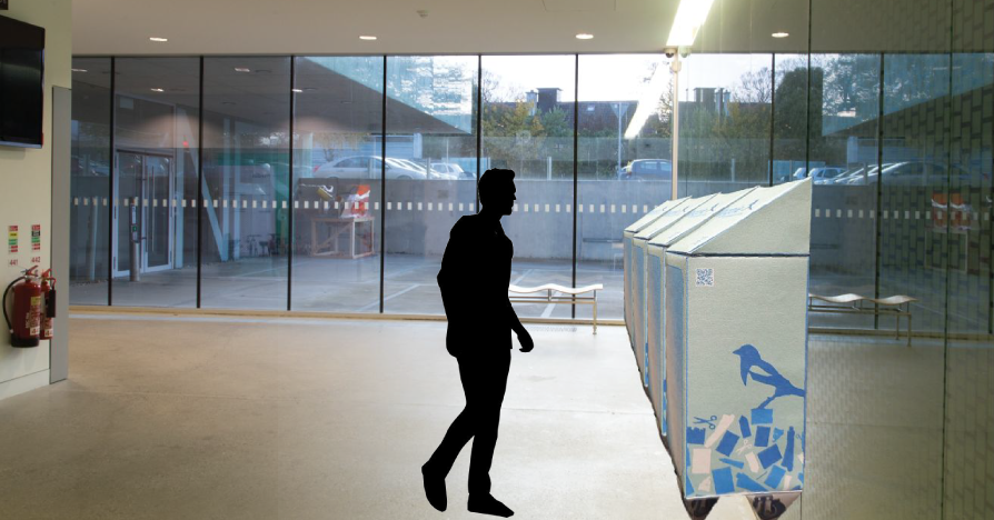
Final Mockup
I finalised my design and applied it to a custom net of the units before printing and assembling the 3D prototypes. I photographed the models from various angles, removed the backgrounds in Photoshop, and placed them into images of the intended college locations. To convey scale, I added figures of people to the scenes.
QR Code & Motion Graphic
I placed a QR code on the side of the units that links to the IADT website, where users could find instructions, unit locations, and other relevant information.